Behind the Screen: How We Built a Digital Home for the Wistron Foundation
When you visit the newly designed Wistron Foundation website, you aren't just looking at a corporate landing page. You are stepping into a decade-long journey of sustainability, habitat protection, and community care.
As the web developer behind the platform, my mission wasn’t just to make something that looked good. The real challenge was taking over ten years of deep grassroots work—from adopting wetlands to running eco-education programs—and translating it into a fluid, intuitive digital experience.
Here is a look at the core features we built and the tech driving it all under the hood.
Designing for a Mission: The Interactive Timeline
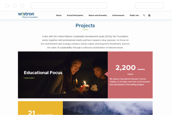
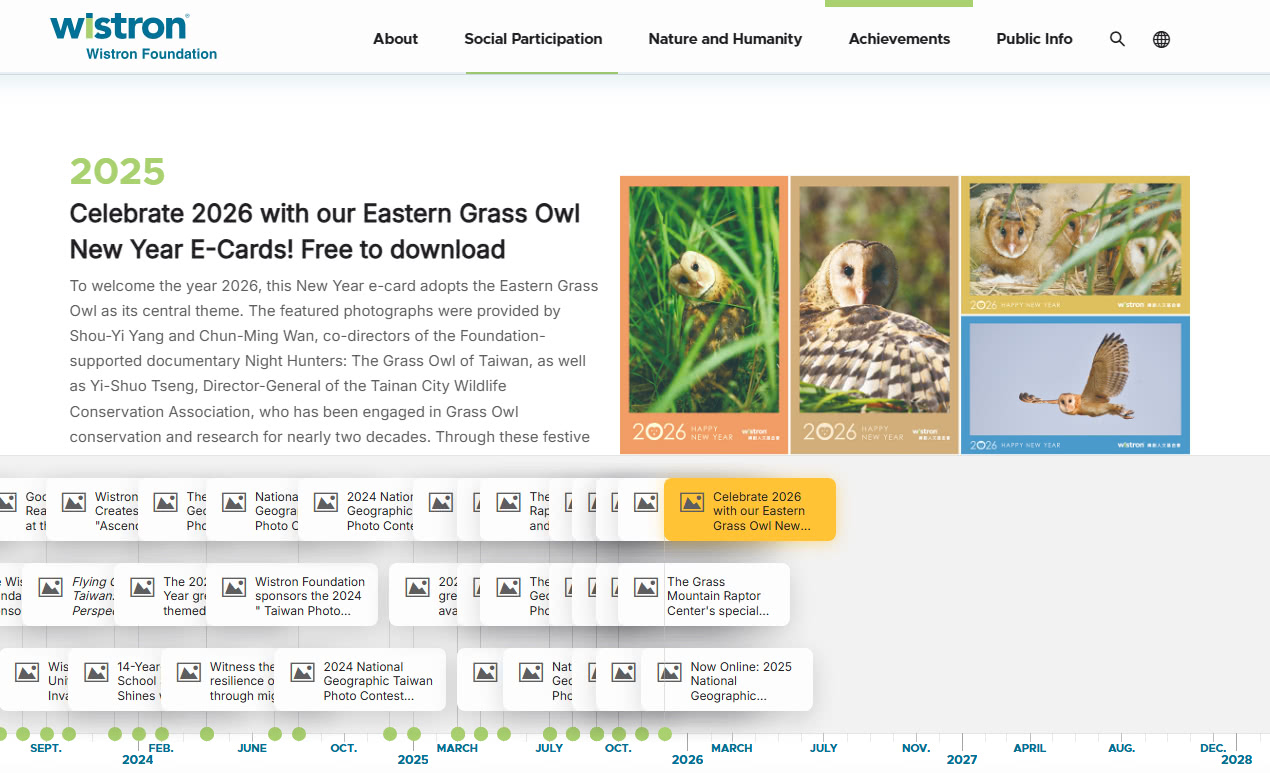
The foundation works across six major pillars, meaning there is a massive amount of history to show. To prevent "information overload," we built what I consider the heart of the site: The Interactive Project Timeline.
Instead of forcing users to click through endless nested menus to see past initiatives, we created a chronological journey. Visitors can smoothly glide through the years to see how a small habitat project blossomed into a massive environmental education network. It gives an immediate, visual sense of scale and momentum, proving that sustainability is an ongoing timeline, not a one-off campaign.
The Technical Aspect: How It Works
To keep things down-to-earth, I won't drown you in lines of code, but the site's architecture is something we are incredibly proud of. Here is how we tackled it from a development standpoint:
- Dynamic Grid Layouts: Building a timeline that feels natural on both a 4K desktop monitor and a narrow smartphone screen is tricky. We leveraged modern layout engines like CSS Grid and Flexbox for a fully fluid design.
- Seamless State Management: The timeline isn't hardcoded. It hooks into a structured database. We used lightweight state management so that when you filter projects by a specific category, the timeline updates instantly without forcing a slow page reload.
- Performance-First Animations: A website about nature should feel organic, so we implemented subtle scroll-driven animations. To keep the site lightning-fast, we skipped heavy libraries and used the browser's native Intersection Observer API.
- Eco-Friendly Code: There is a sweet irony in building an environmental site that hogs server energy. We optimized images using modern WebP formats and kept our JavaScript bundle incredibly lean. This minimizes the processing power required by your device, directly reducing the site's digital carbon footprint.