Typography & Spatial Hierarchy
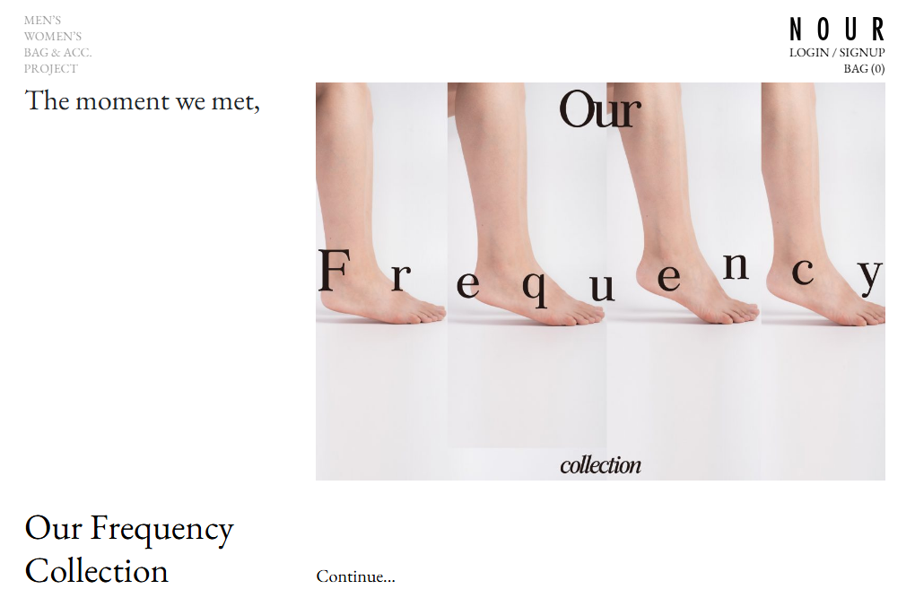
The typography choices on this platform do a lot of the heavy lifting. When a website relies on a minimalist aesthetic, type scaling and spacing become the design itself.
Here is how I implemented the style:
- Generous Letter-Spacing (Tracking): I utilized deliberate, widened letter-spacing on headings and navigation elements. This CSS adjustment instantly elevates the text, giving it an editorial, high-end feel that prevents the layout from looking like a generic template.
- Restrained Font Weights: Instead of throwing bold and heavy fonts everywhere to grab attention, I relied primarily on light and regular font weights. Visual hierarchy is achieved beautifully through scale (font size) and whitespace rather than sheer thickness.
- Fluid Typographic Scaling: The text scales naturally across viewports. Whether viewing the site on a mobile device or a wide desktop monitor, the font sizes shift smoothly, preventing awkward text wrapping or massive headings that swallow the screen.
- High Contrast Readability: By pairing crisp, dark typography against a clean, neutral background, I ensured excellent legibility and accessibility compliance without compromising the subtle color palette of the brand.

Technical Execution & Performance Optimization
Under the hood, I made several structural choices that prioritize user experience, performance, and clean code management.
- Frictionless Spam Prevention (The Honeypot Technique): By using the classic "Leave this field empty if you're human:" honeypot field, I successfully block automated spam bots. This is a massive win because it protects the database from spam without forcing real users to click through annoying, visually jarring CAPTCHA puzzles.
- Asynchronous Interaction Design: The interactive elements—such as updating user account states or cart tallies—happen quietly in the background. Leveraging asynchronous JavaScript (AJAX/REST APIs) allows data to sync with the server seamlessly without triggering jarring, full-page reloads that disrupt the browsing flow.
- Semantic HTML & Clean Layout Engines: The site's grid structure is remarkably clean. By utilizing modern layout tools like CSS Grid and Flexbox, I achieved pixel-perfect alignment of editorial blocks and content grids. This drastically reduces code bloat and ensures the browser can render the entire layout almost instantly.
- Asset Pipeline & Core Web Vitals Optimization: For a brand that relies heavily on high-fidelity visual assets, performance can easily tank if images aren't handled correctly. I implemented robust asset management, utilizing responsive image tags (
srcset) and deferred loading (lazy-loading). This ensures that heavy files are only requested and downloaded when they are about to enter the user's viewport, keeping initial load times incredibly fast.